
Adobe Illustrator & Procreate, 2025 — Case Study

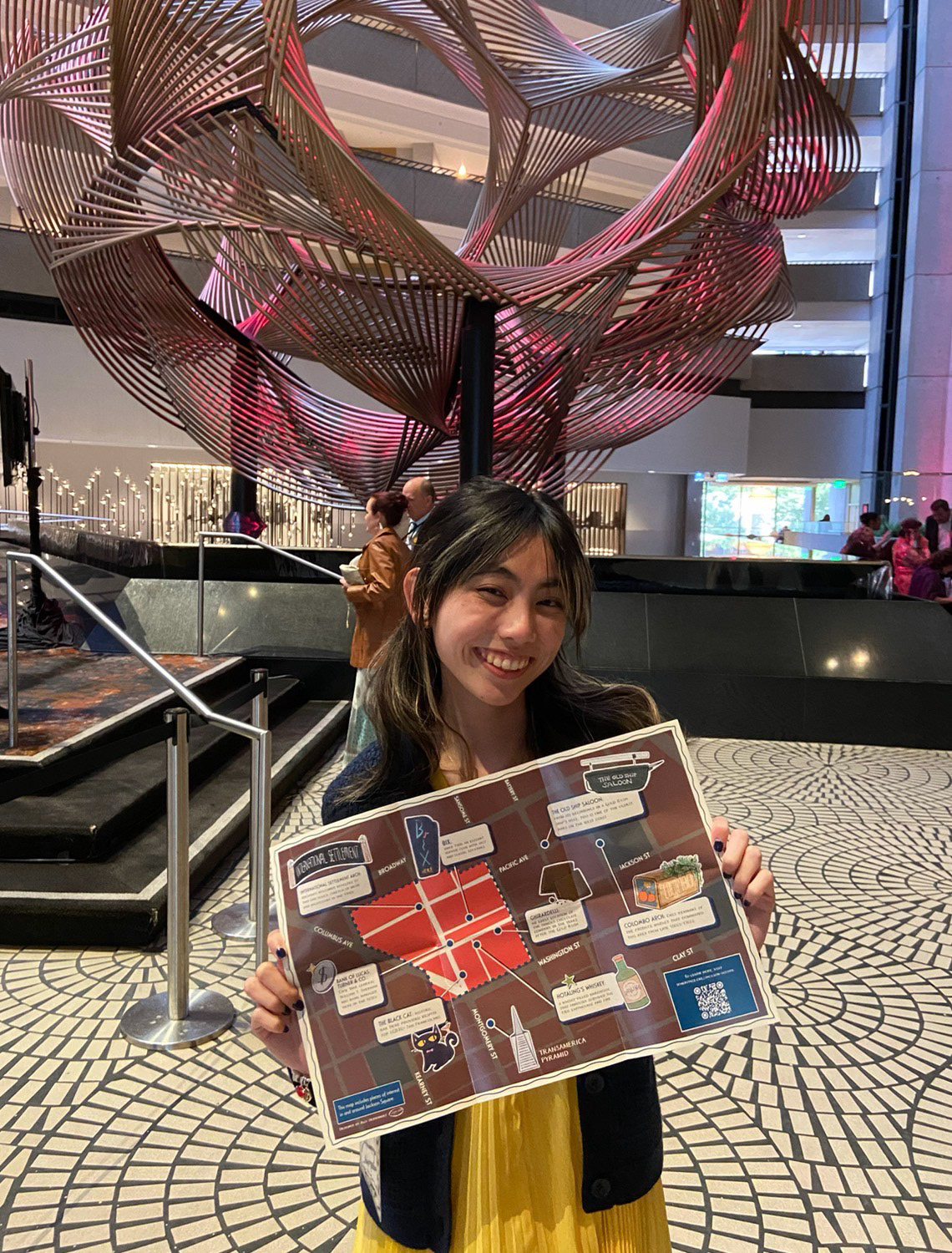
at the Spelndid Survivors Gala 2025!
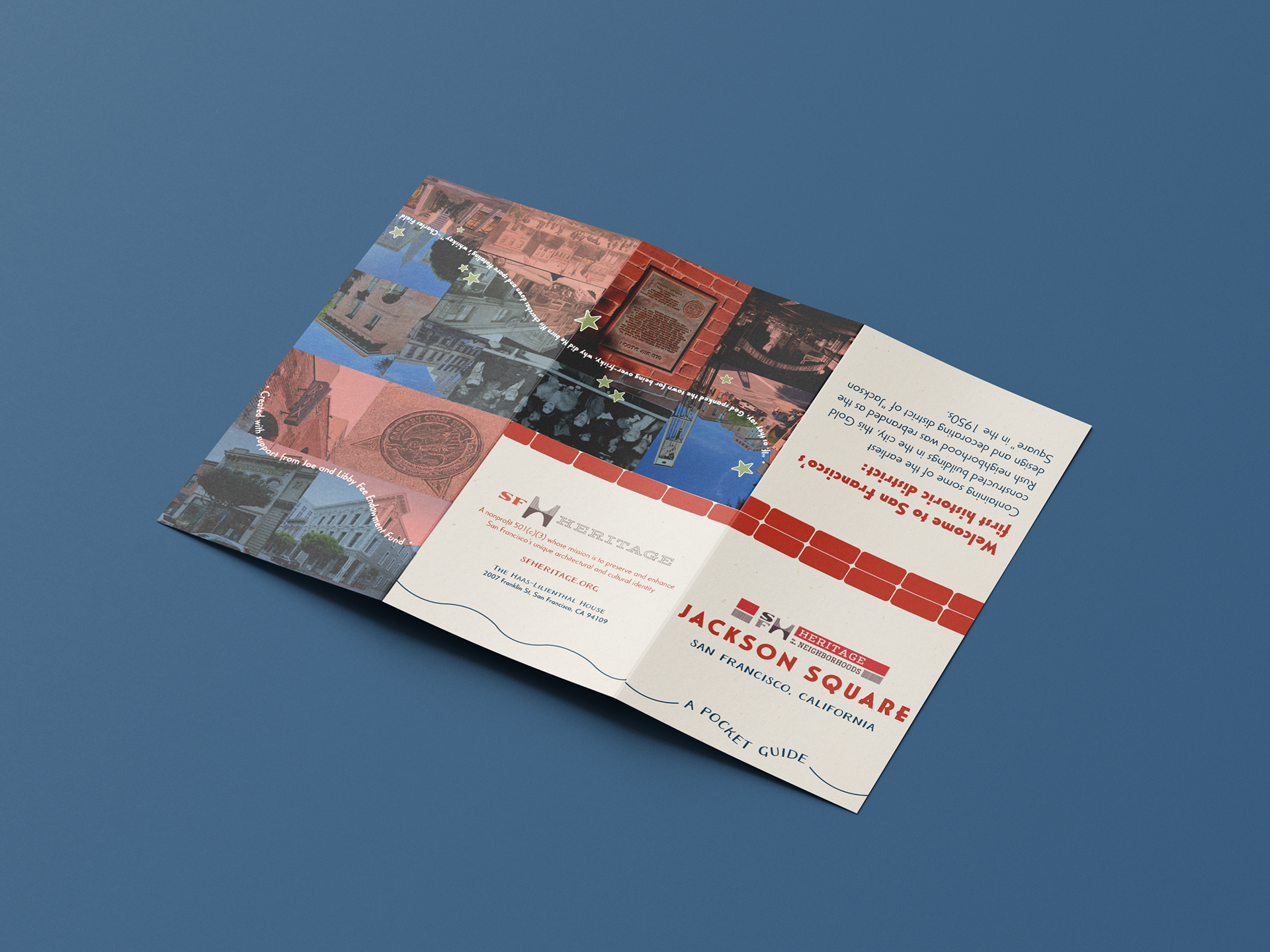
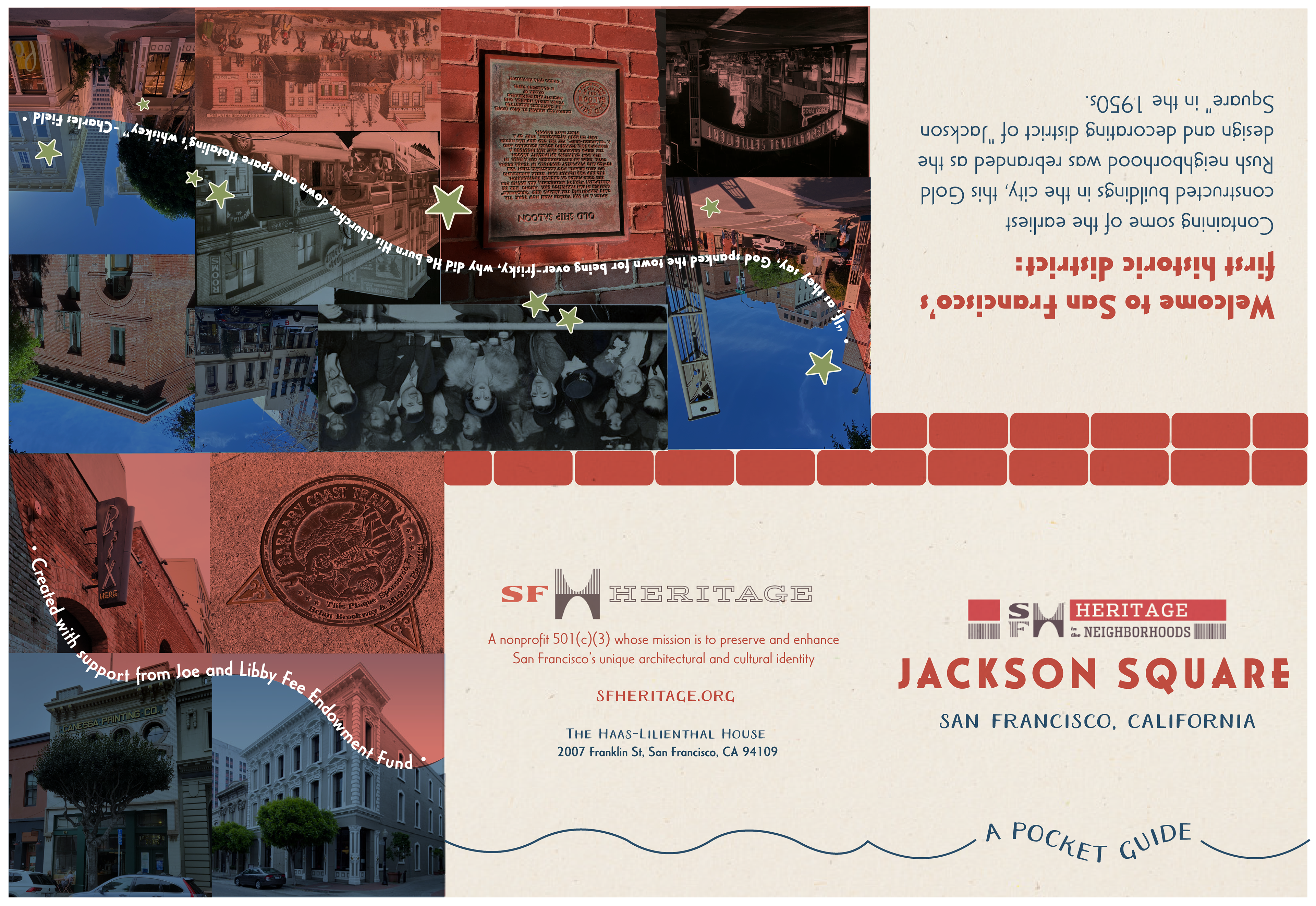
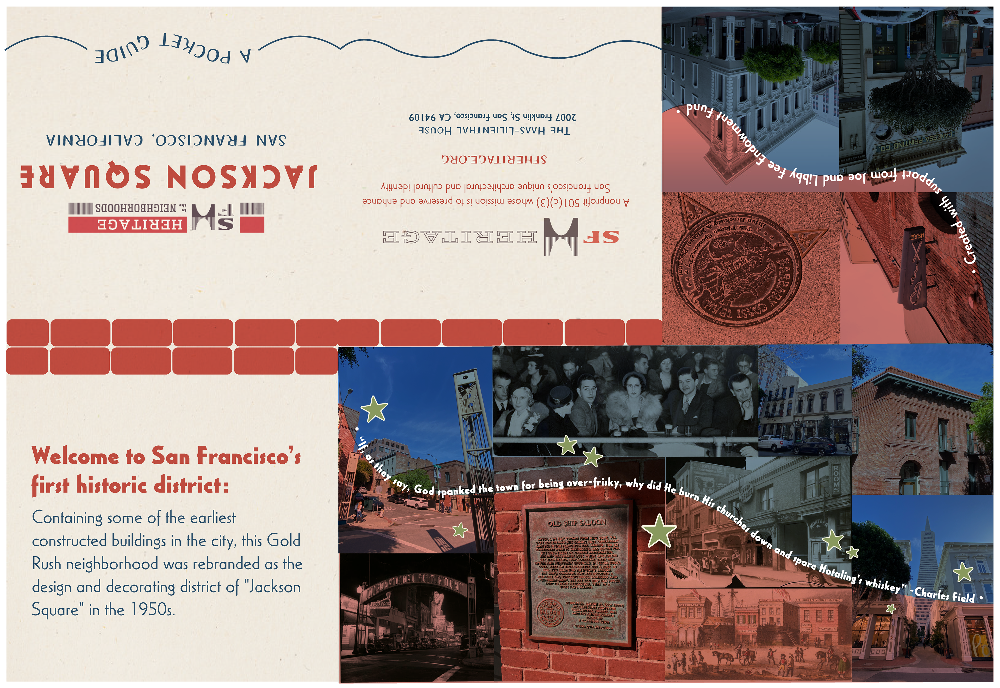
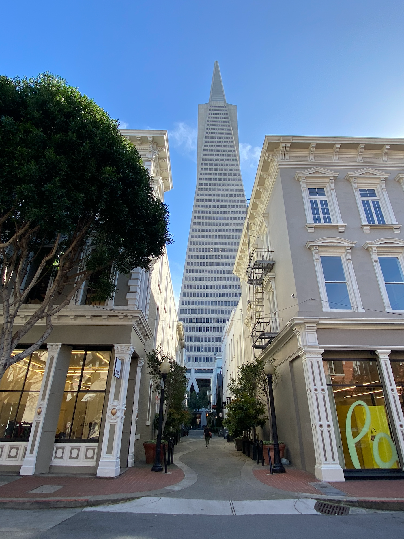
During my spring internship at SF Heritage, I was tasked to work on a project for the Heritage in the Neighborhoods program, which is a program that highlights different SF neighborhoods and its rich histories. The first neighborhood to be covered for 2025 was Jackson Square, SF’s first appointed historic district. This small district located downtown near the Transamerica Pyramid is often overlooked, disguised by the high end luxurious shops and cafes that now overshadow its historical buildings. The goal of this map pamphlet and overall coverage of Jackson Square is to educate fellow history enthusiasts or any curious individual about the historic district, and the ways in which places are built upon layers and layers of history. This map will supposedly be distributed during SF Heritage’s Happy Hours or at the Splendid Survivors Gala taking place in June 2025.
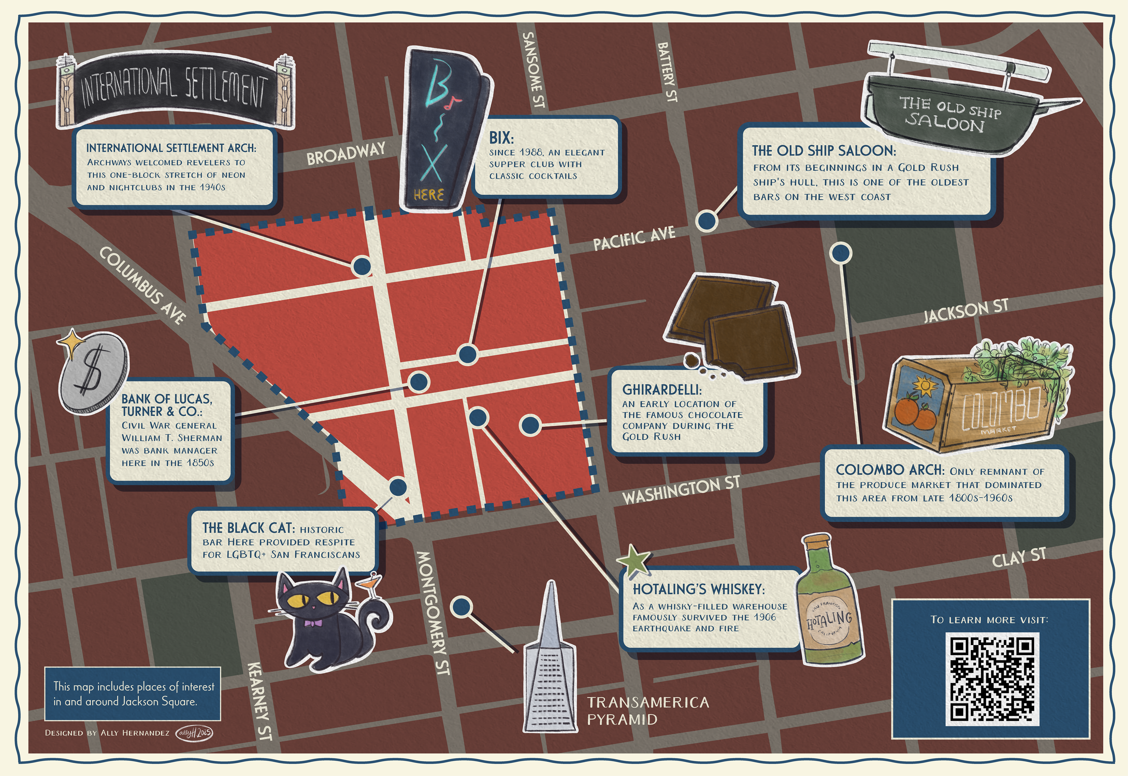
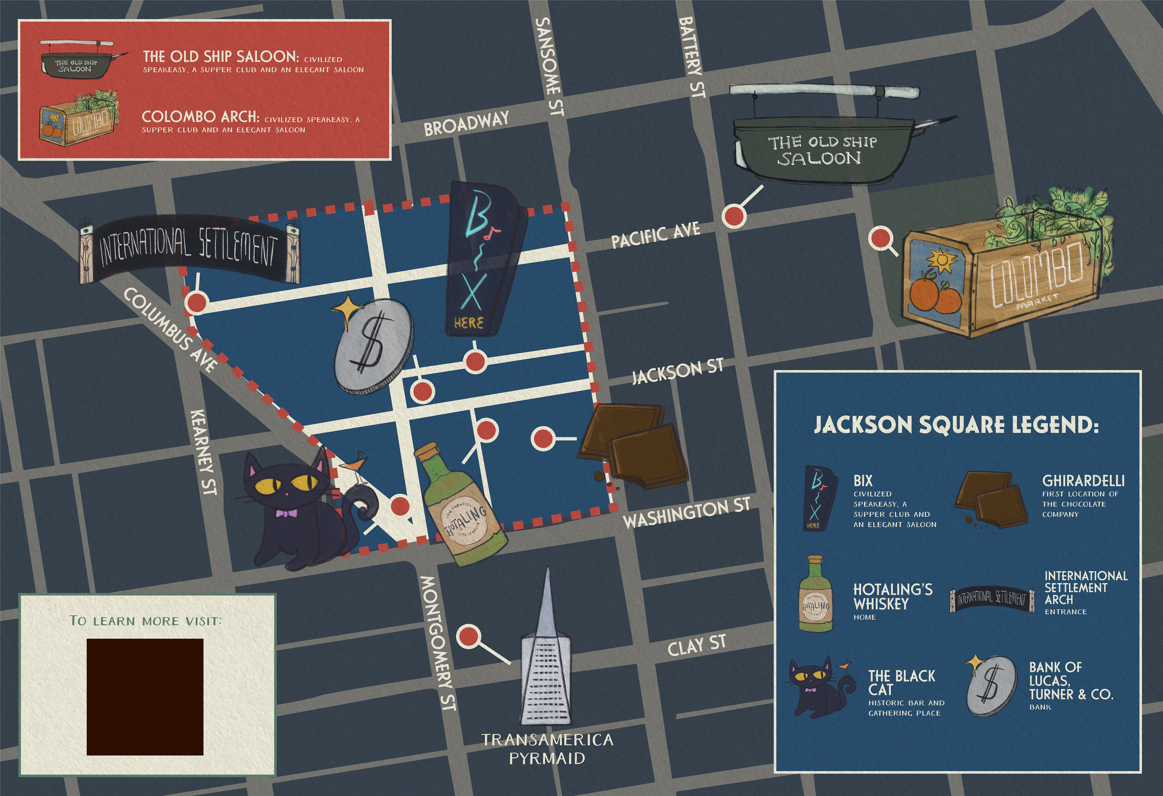
My task was to design a map in a pamphlet style to be easily accessible and portable, which could also be available online on SF Heritage’s website. Before any design work, I read about Jackson Square’s history online and sifted through archived photos through SF Public Library’s database. My supervisor Kerri Young and I embarked on a walking field trip to the district (walked down Pacific Ave), where my supervisor explained the history of certain buildings and I took photos for visual inspiration.
Below is a documentation of my research and design process!

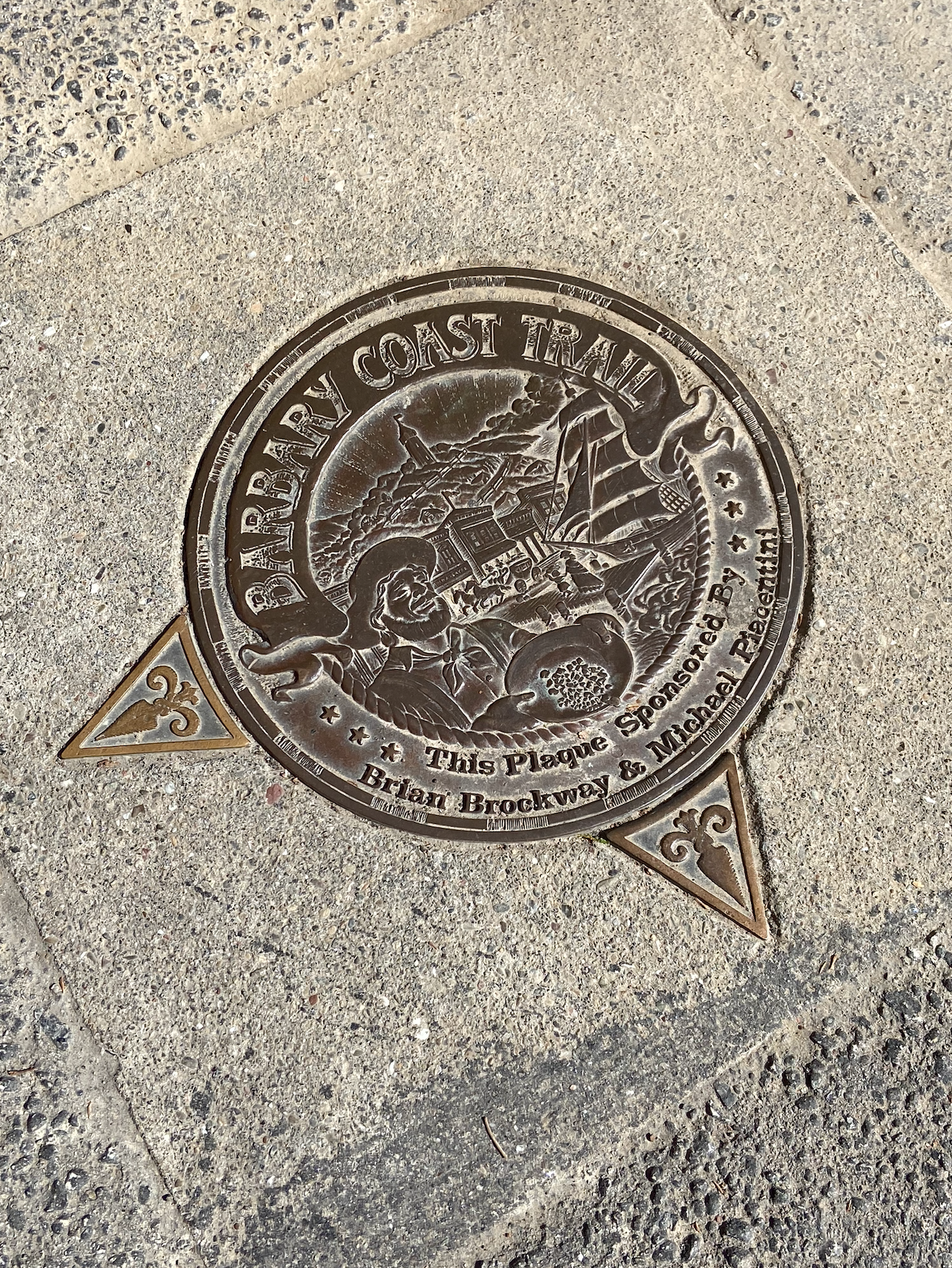
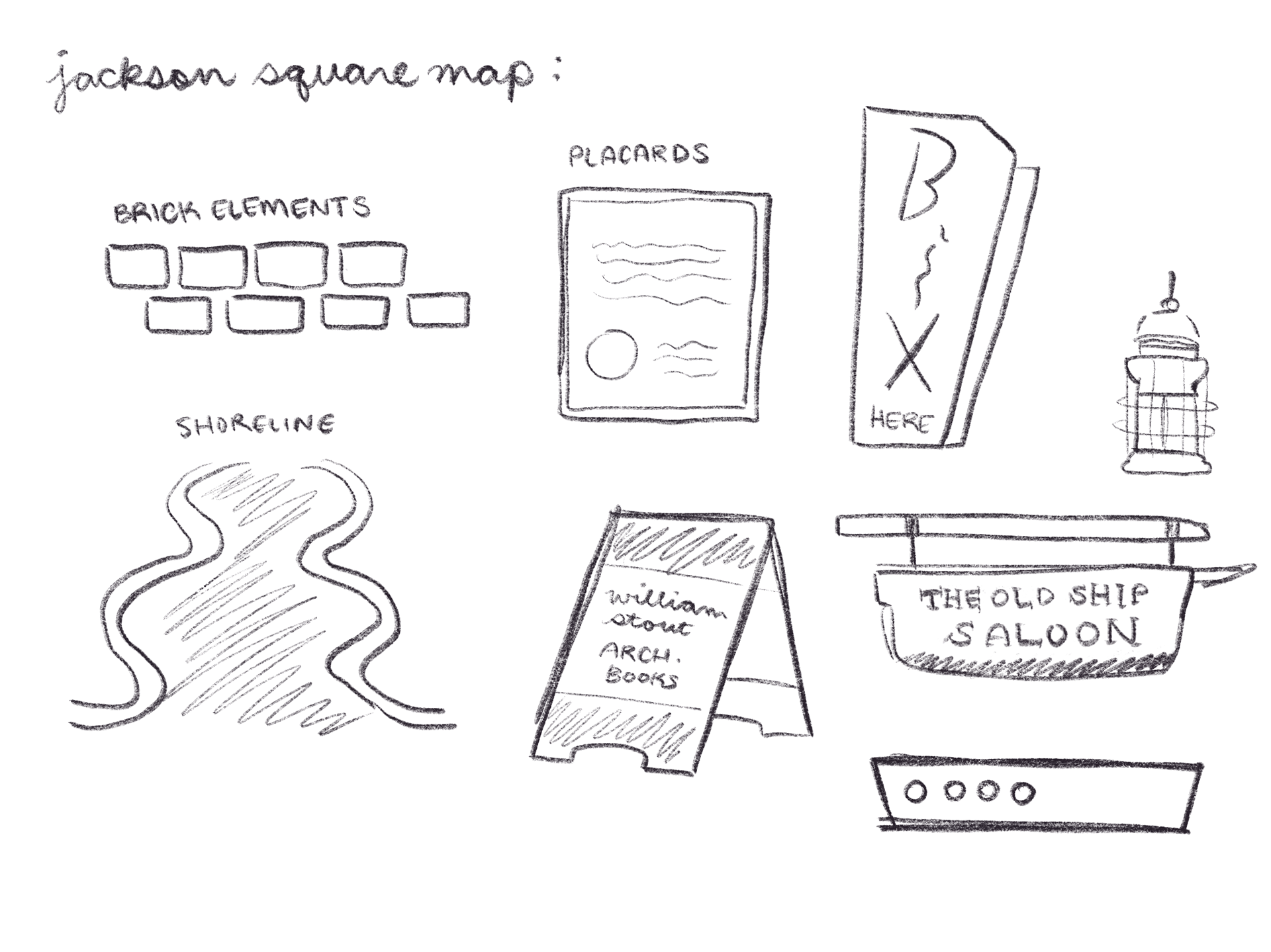
Before working on the map page, I started with the “front” of the pamphlet which includes the cover and back with important information about SF Heritage. Inspired by a previous SF Heritage pocket guide, I included a collage of my photos and the library’s photos and a fun poetic reference to the district: a poem written by Charles Field after the 1906 earthquake destroyed buildings around the district except for the infamous Hotaling Whiskey Building. Two visual motifs that I wanted to incorporate were the district’s red brick exteriors and the Barbary Coast Trail shoreline found near the Hotaling Building (in front of the Transamerica Pyramid). On the pocket guide, these motifs can be found in the red and blue color palette, the wavy lines of text, and the wave borders framing the map. Kerri suggested creating icons for the nine places we would be plotting, which would be paired with written descriptions written by Kerri and SF Heritage’s CEO Woody LaBounty. I created the icons in Procreate for a more “hand illustrated” look rather than a formal and flat vectorized look. Afterwards, I took a Google Maps screenshot and customized upon that in Illustrator.
One of the main challenges was navigating a small space for the map. This map is 11 x 17 inches, perfect for a pocket guide, but comes with space limitations. Kerri and Woody did their best to shorten written descriptions, while I managed to fit everything in the space without looking too crammed. Originally, the written descriptions were all in one box as a “legend” for the map, but I decided the best way to use the space was to scatter them — this decision actually made it seem less cramped than in a single box. The important part about this guide was how it is intended to be less “formal” and more fun and organic, while still being informative and urges audiences to discover and explore more.
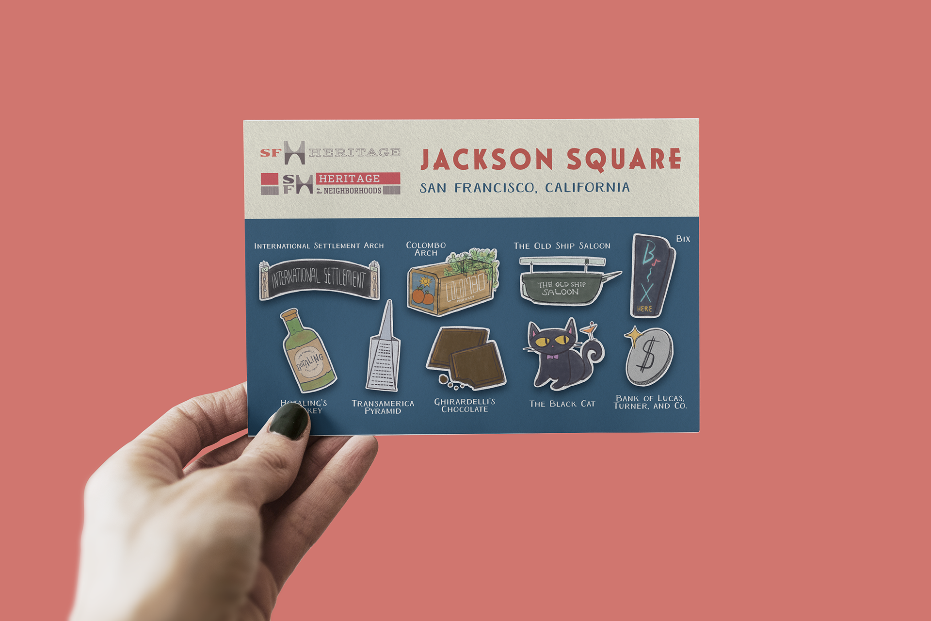

In addition to the pocket guide, I created a few mockups for future opportunities for the icons that might be interesting, including enamel pins and a sticker sheet.
Credits to Kerri Young & Woody LaBounty (map descriptions) and the SF Public Library Photo Archives.