Adobe Illustrator, 2025
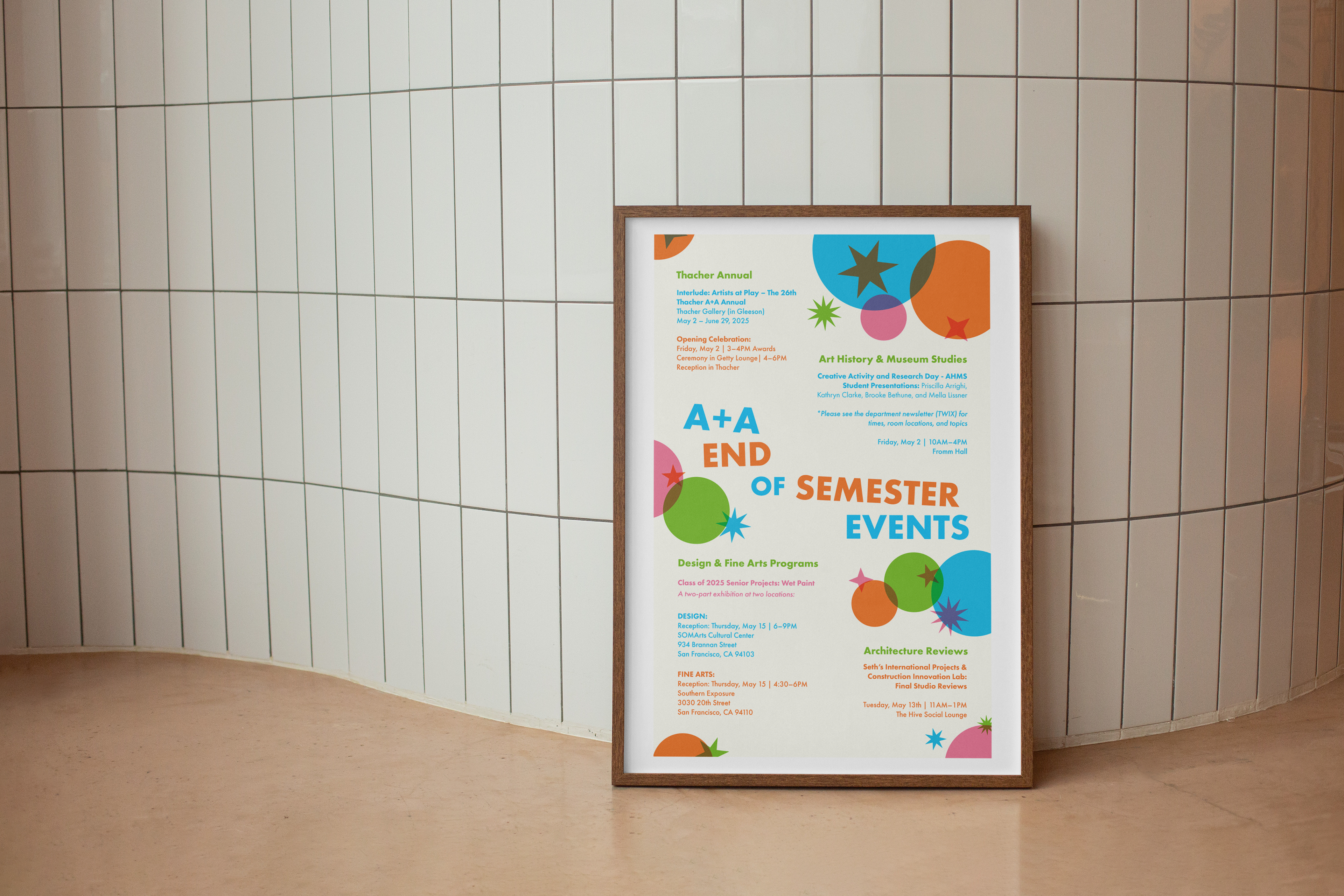
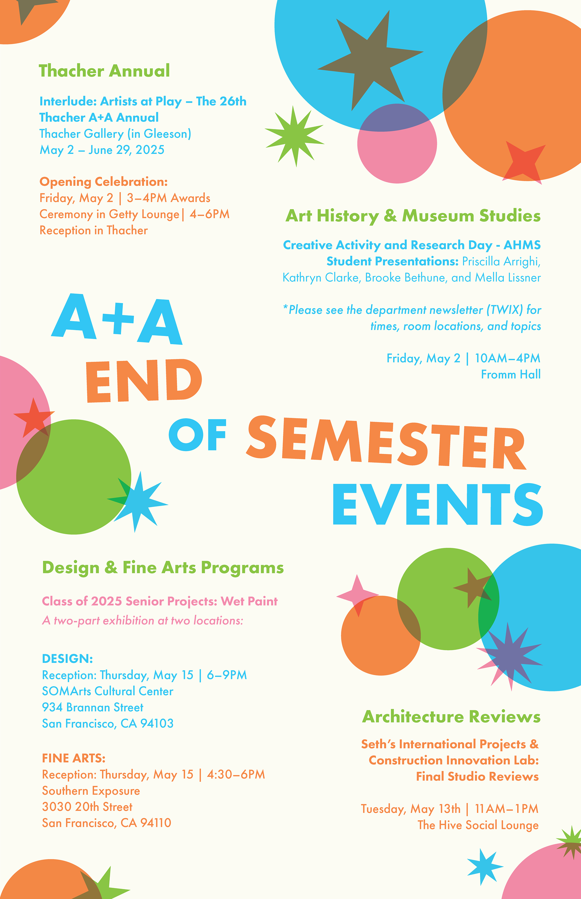
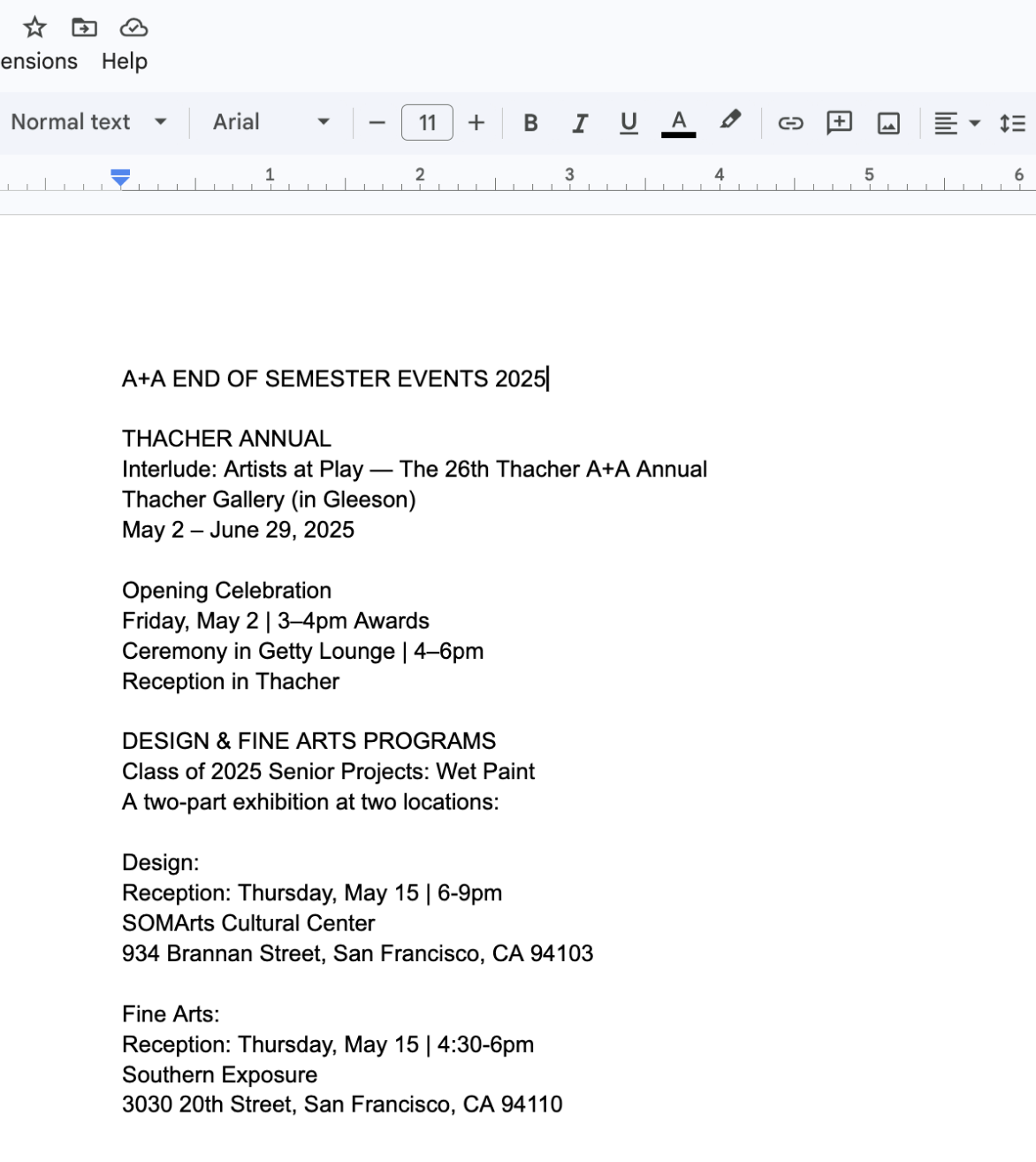
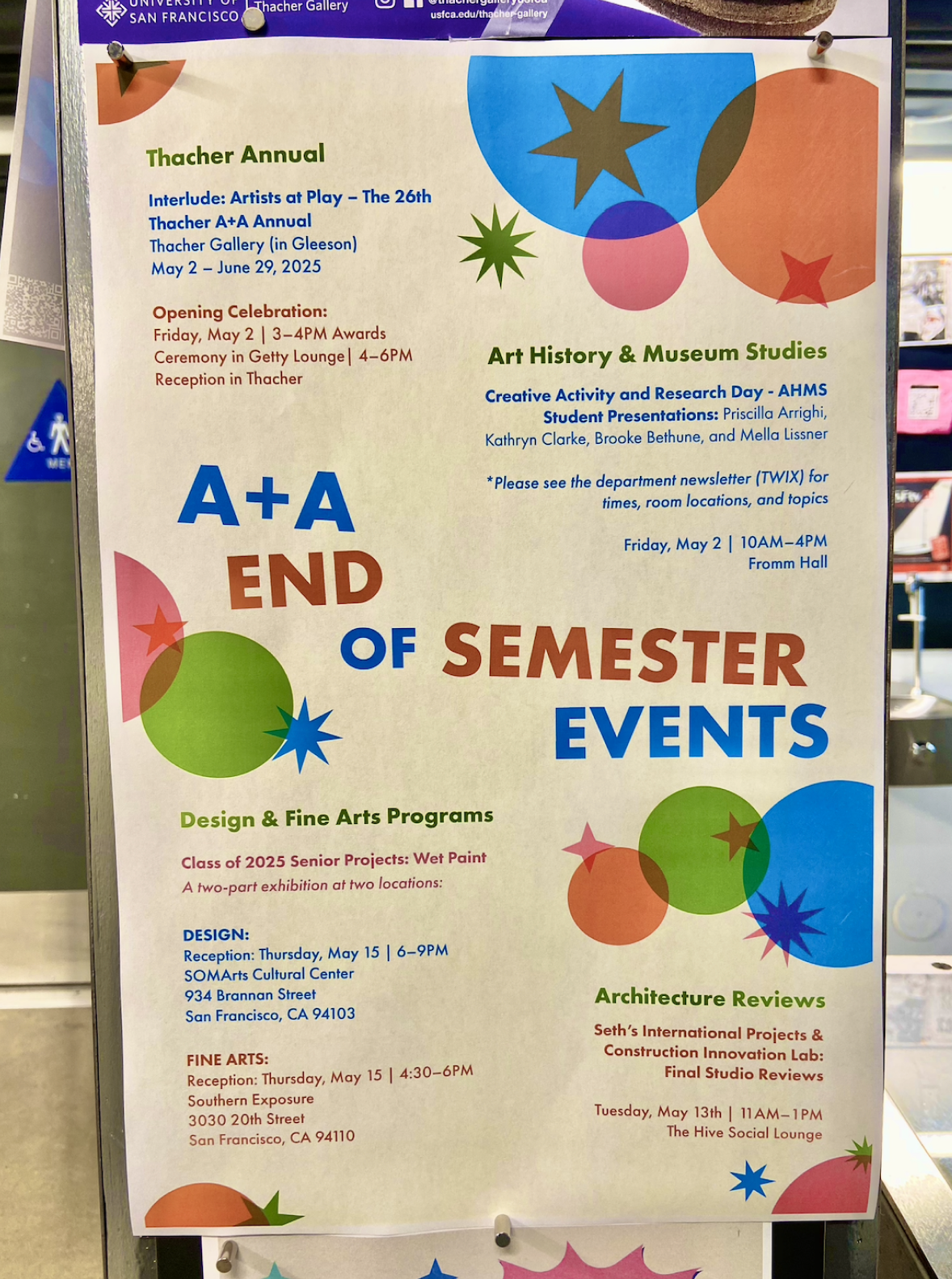
As a graphic designer for USF’s Art + Architecture department, I received a creative brief of creating a poster that would list the end of semester events. At the end of each spring semester, there are numerous senior projects, final presentations, and gallery shows. Having the events listed in one place is convenient, but the challenge was to capture a passerby’s attention in the university halls.
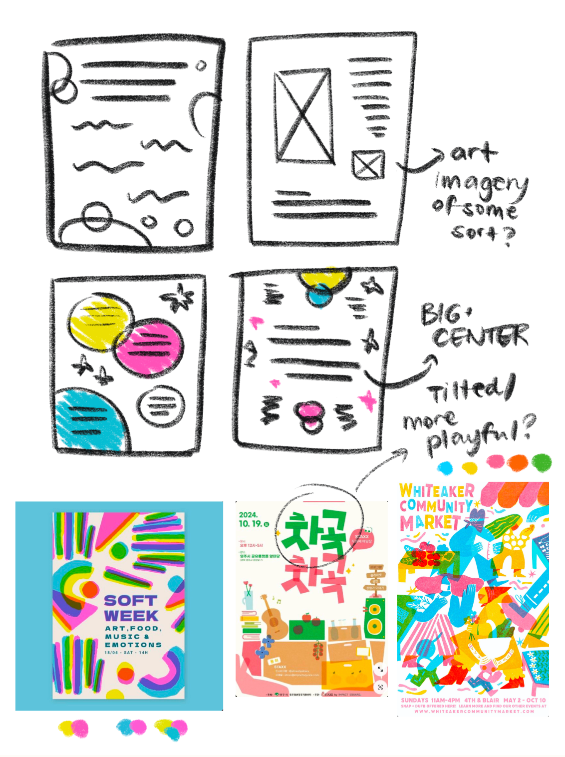
I looked to risograph printing as color palette inspiration, and combined it with abstract shapes and a bold sans serif. This way, the poster didn’t seem as anxiety-inducing for students (who are already stressing!) and seems more approachable. I wanted the title to be big, front, and center rather than starting at the top like a typical text-heavy poster. With the type hierarchy, I enjoyed experimenting with different colors in addition to the stroke weights.
I looked to risograph printing as color palette inspiration, and combined it with abstract shapes and a bold sans serif. This way, the poster didn’t seem as anxiety-inducing for students (who are already stressing!) and seems more approachable. I wanted the title to be big, front, and center rather than starting at the top like a typical text-heavy poster. With the type hierarchy, I enjoyed experimenting with different colors in addition to the stroke weights.